Brand guidelines
Tendly is warm, calm, and dependable — like a neighborhood studio that has its act together. These are the building blocks.
Logo
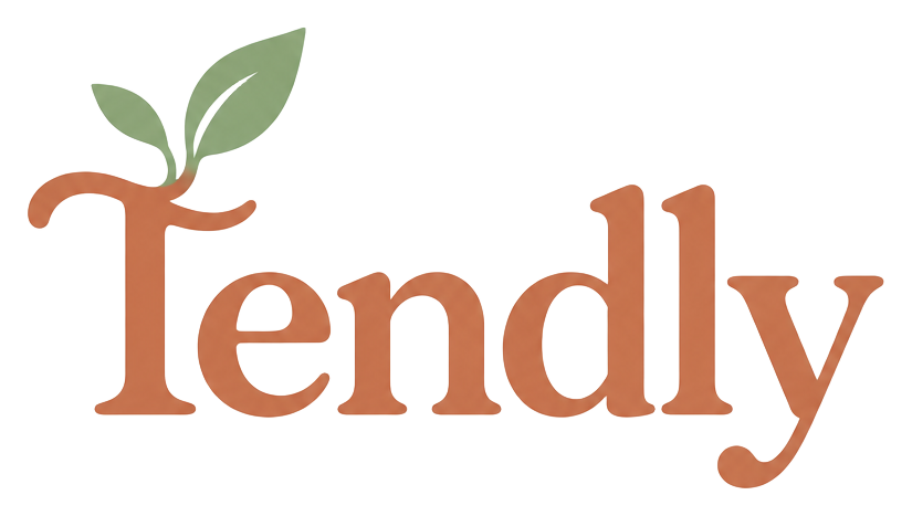
The sprouting T stands for tending — care, growth, and attention. Give it room to breathe: clear space equal to the height of the leaf on all sides. Never recolor, stretch, or add effects.
Colors
Terracotta
#C86B4D
Primary — buttons, key actions, the heart of the brand
Sage
#8BA88E
Highlight — steps, success states, calm surfaces
Deep Sage
#4A6741
Secondary text on light sage surfaces
Soft Peach
#E8A87C
Accent — icon tiles, gentle highlights
Warm Cream
#FCF9F7
Background — the canvas everything sits on
Warm Ink
#2D2926
Text — warm near-black, never pure black
Typography
Headlines — Fraunces
Booking made beautiful
Body — Figtree
A warm, simple way for your clients to book appointments and for you to grow your business. Friendly, clear, and never fussy.
Tone of voice
We sound like
- • A friendly receptionist who knows every regular by name
- • Warm, professional, and simple
- • Written for a busy salon owner, not a tech crowd
We never sound like
- • Corporate jargon ("leverage", "synergy", "solutions")
- • Pushy sales talk or fake urgency
- • Cold, technical error messages